Three years in Mallorca. One small box.
I trained at the Rafa Nadal Academy in Mallorca for three years — long enough to know the heat of the clay, the rhythm of warm-ups before sunrise, and the small rituals players keep to themselves. When DECO2018 asked for a giftable object built across three fabrication methods, I didn’t reach for a brief. I reached for a person.
Smash cravings, not your racquet.
A merchandise drop for a team I'd actually buy.
DECO2018 set the brief: a thematically branded chocolate, its packaging, and the promotional material to launch it — a merchandise piece for a team at an upcoming major competitive event. The brief picked the deliverables. I picked the team.
- Deliverables
- 3 modules · 1 object
- Audience
- Loyal fans · curious newcomers
- Position
- Collectible · premium
No team logos for sale — the tribute had to be built from form, ritual, and material.
- M·AAdditiveFusion 360 → 3D printThe chocolate mould.
- M·BSubtractiveFusion 360 → Laser cutThe walnut court-box.
- M·CMaterialsBlenderThe promo render.
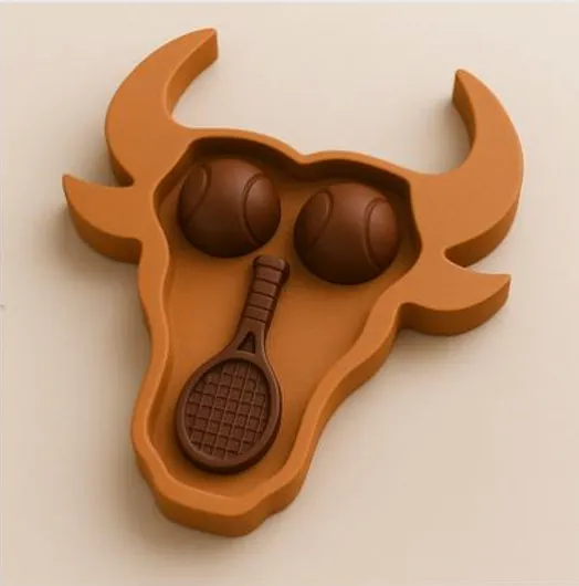
A bull that didn't make it to chocolate.
The first sketch was a bull’s head. It checked every box on paper — Spain in one stroke, and a quiet wink to Rafa’s own silhouette logo, the charging bull. I went into tutor consults proud of it.
The tutors were kind but direct: a bull head, in chocolate, at this scale, with these printable mould draft angles? The horns alone were going to fight me — undercuts, demoulding, finish quality. By the third consult it was clear the geometry wasn’t going to survive contact with a vacuum-formed mould.
The ambition didn’t disappear.
It migrated.
So I let the bull go. The chocolates stayed honest — a racquet and two balls, forms that want to be moulded. Everything I’d wanted the bull to carry — the Spanishness, the ritual, the sense of occasion — got rebuilt into the box.
before the geometry talked back.
From a 22 in CAD to a 22 in chocolate.
Nadal won twenty-two Grand Slams. The racquet’s where he wrote them. So the centrepiece had to be a racquet — and the number had to be on it, raised, the way medals carry numbers on their backs.
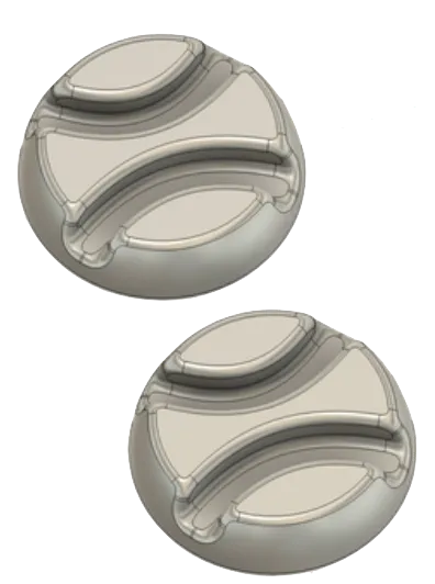
In Fusion, the racquet started life as a flat coin and grew an extruded 22 through the strings. The two ball-coins beside it weren’t decoration — every player’s bag carries a spare. Three pieces, set together, become a kit.
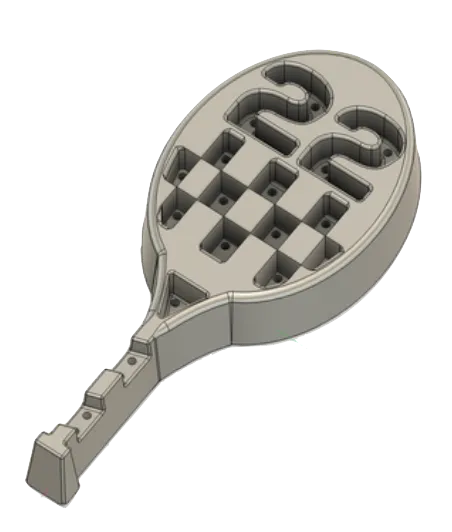
- 01Vacuum form
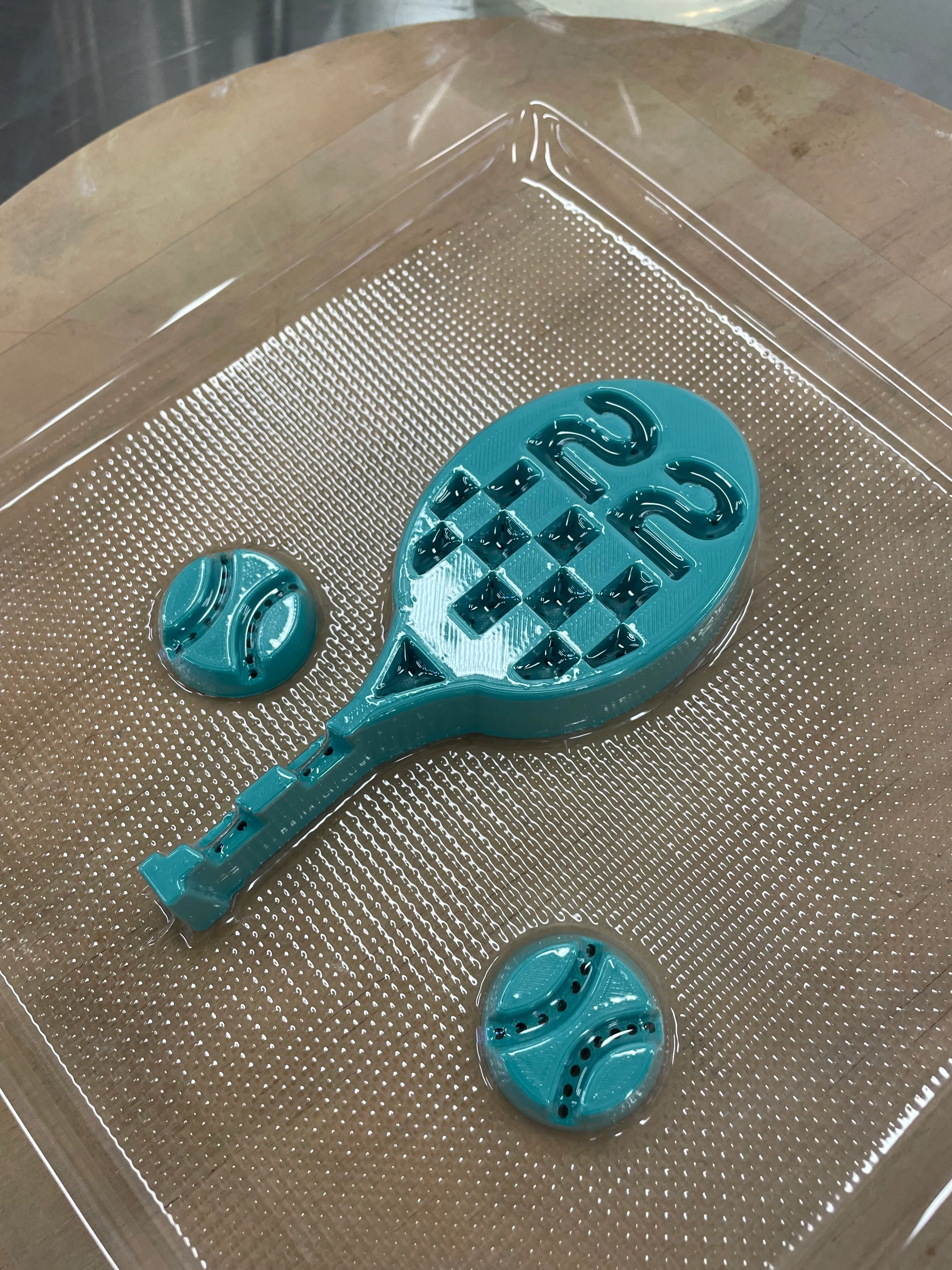
The PLA positive becomes a negative mould — a plastic sheet heated and sucked over the print.
- 02Cast + chill
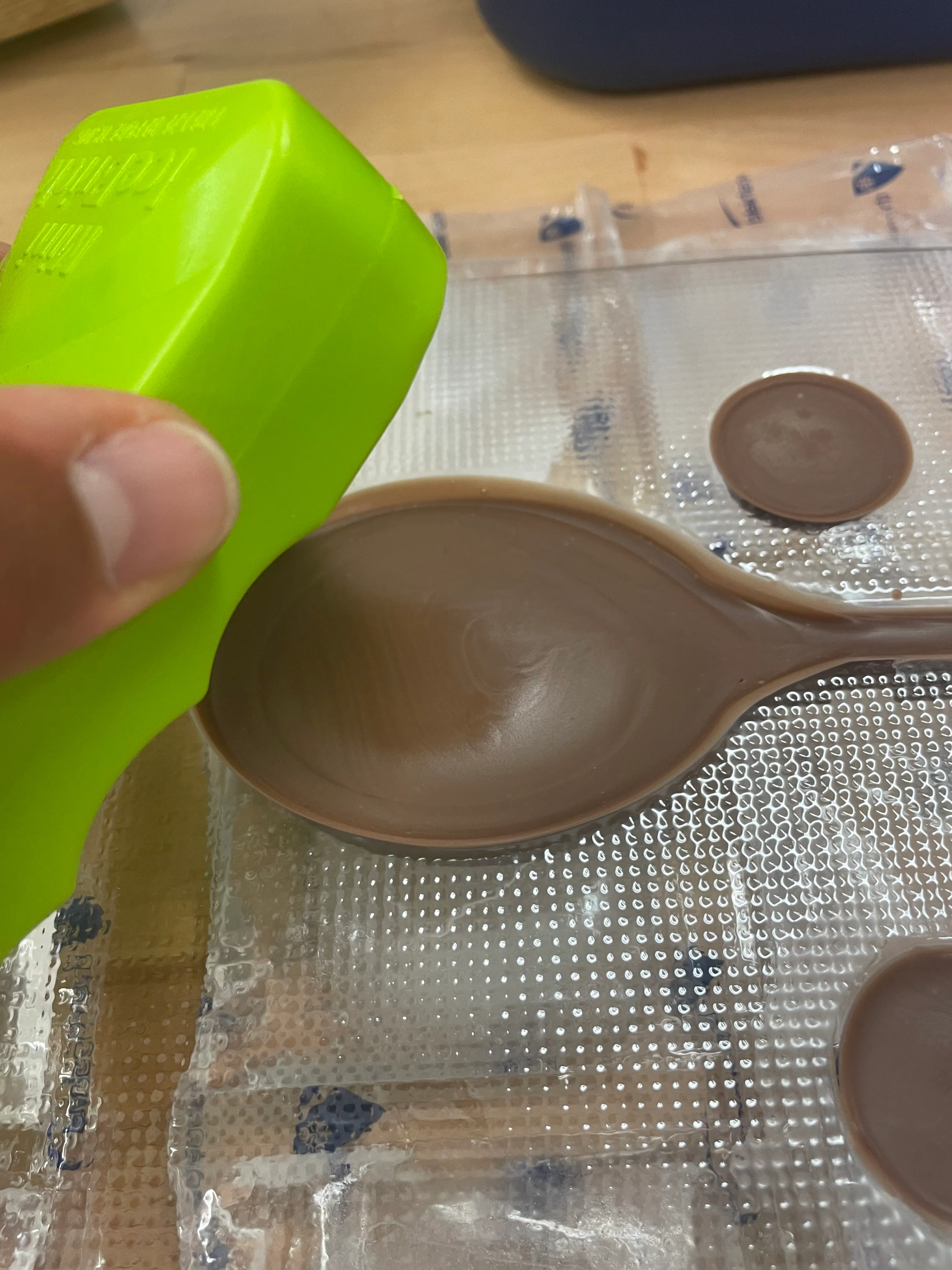
Tempered chocolate poured in, set with an ice pack pressed to the back.
- 03Demould
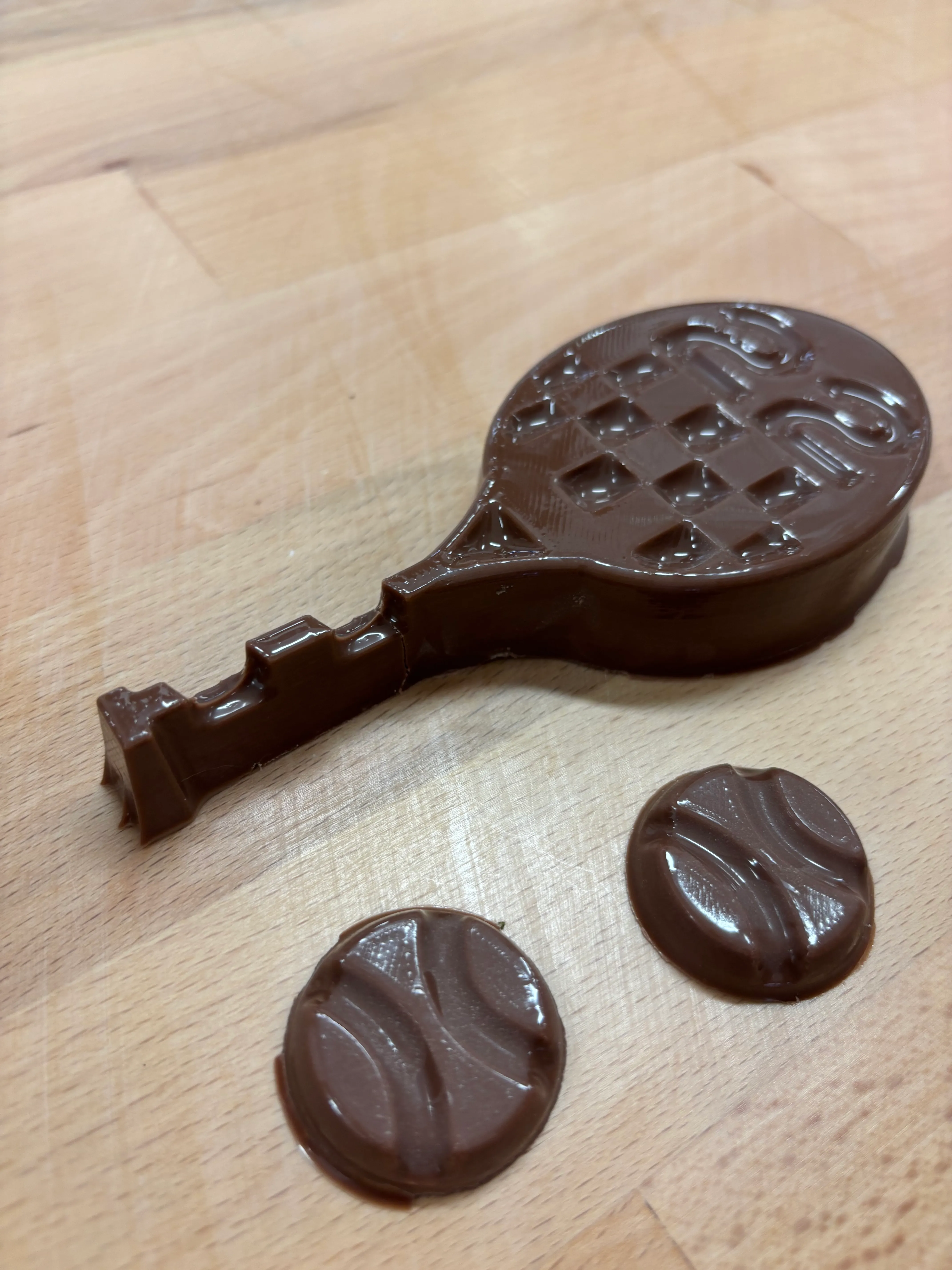
Three pieces, popped clean. Two balls. One racquet. One twenty-two.
Chocolate has a memory. Tempering is just teaching it to stay.
The bull stayed. The court became the box.
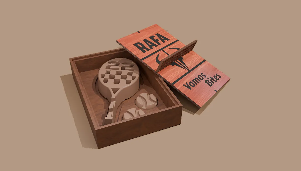
The box did the work the chocolate couldn’t. Walnut, laser-cut, with the lid engraved with everything the chocolate had to leave behind — Rafa’s name, his charging-bull logo, the title, and the court itself.
Walnut for warmth — close-grained, takes engraving cleanly, reads as a club-bench rather than a craft project. The lid carries the whole identity, etched in two passes: low-power for the court lines, deeper for the type.
Inside, the timber is cut to seat the three chocolates — racquet down the centre, two ball-coins to the side. The lid lifts off the base. No hinge, no clasp. You lift it by a small tennis net stretched across the top.
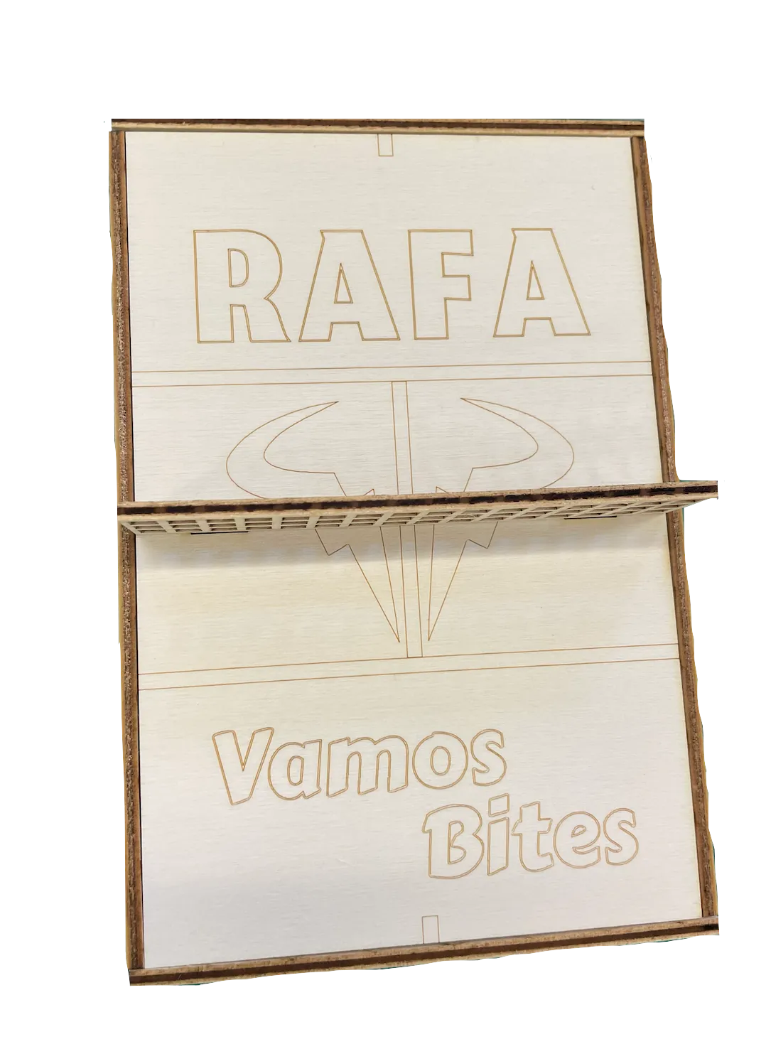
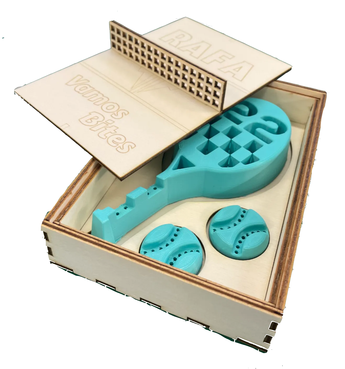
You don’t lift the lid by a hinge. You lift it by the net.
Creating the materials.
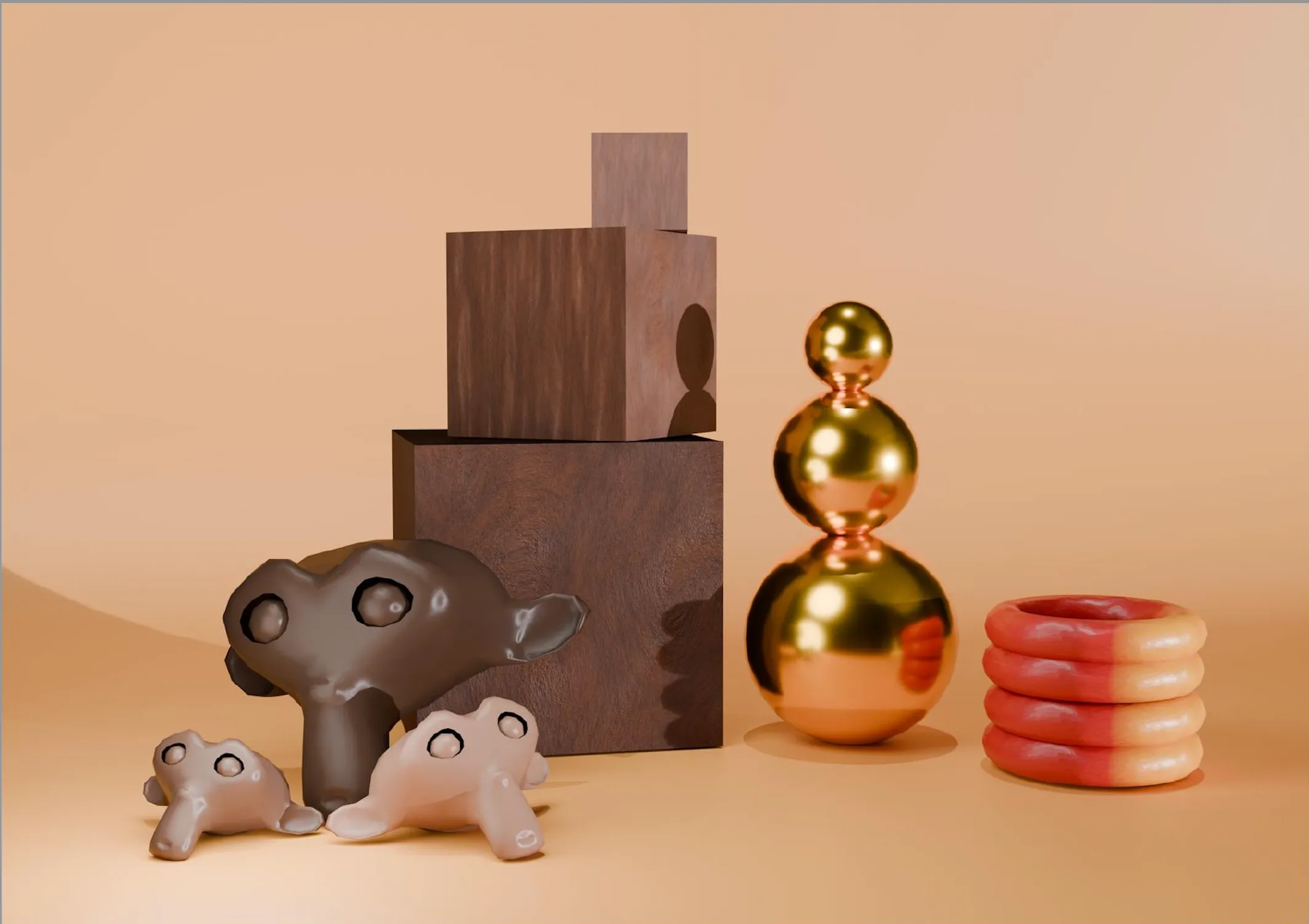
PaletteThe material-showcase brief made me consider what the surfaces should mean as well as how they look. Gold and Spain’s red and yellow led the palette: gold to honour a champion and his Olympic history; red and yellow to declare Spanish identity, echo clay, and nod to the tennis ball.
TrialI trialled plastic and cardboard outers — both felt everyday. A full-wood shell had warmth, but softened Rafa’s attitude. That pivoted me to refine the form and weave in recognisable cues: Spanish multi-coloured bull eyes for quiet pride, and small gold Nike ticks like jewellery, connecting the object to his lifelong sponsor.
StagingI re-staged the opening so the horns read like lightning as the lid lifts, framing the chocolate racquet and two balls. Across passes I sharpened planes and tuned materials until it balanced restraint with energy. Six materials, one frame.
Light is the last material. You don’t pour it; you find it.
One sheet, one breath.
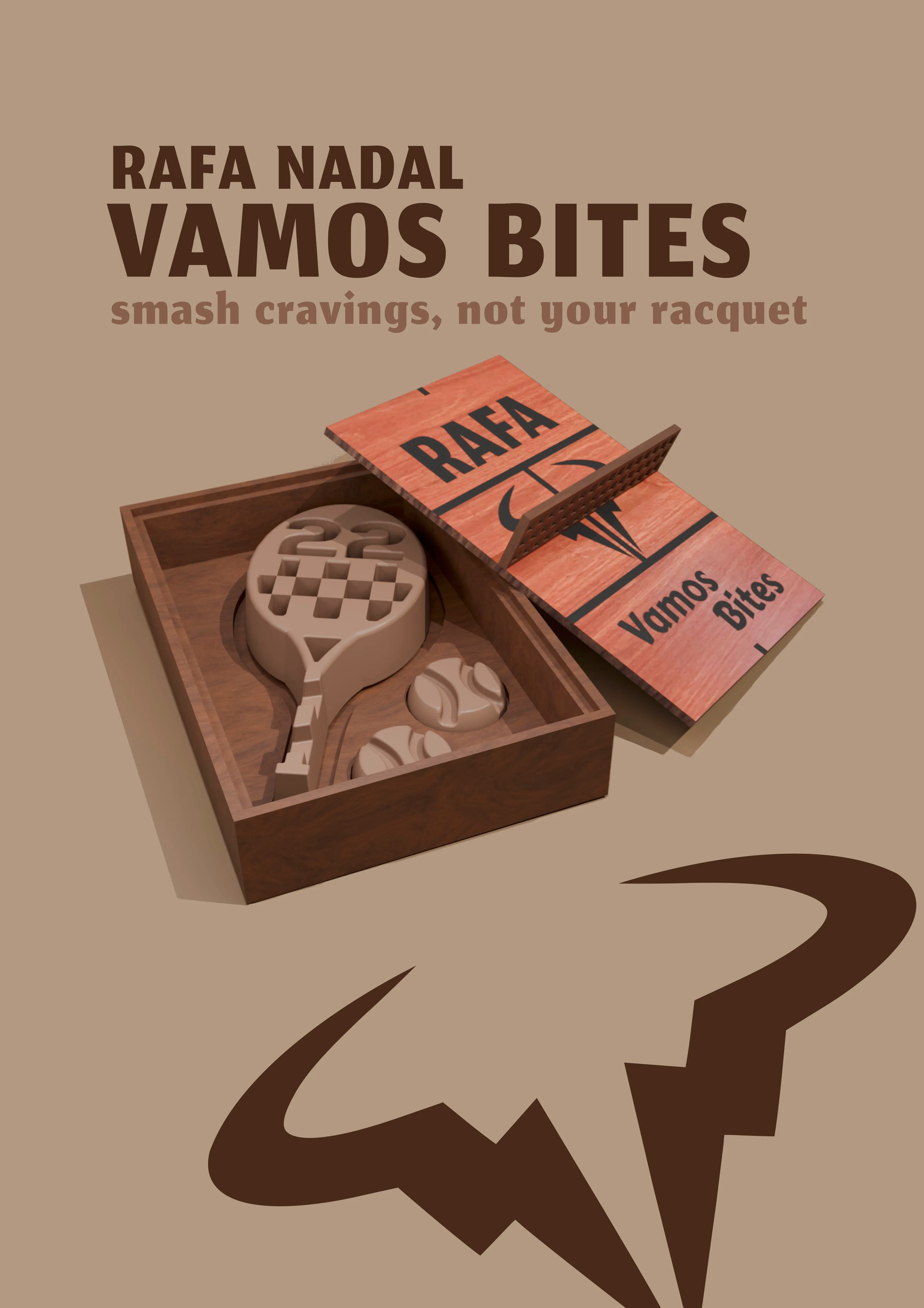
Every module had its own palette — chocolate, walnut, the red and yellow plastic of the render. The poster pulled all of it back to one warm tan. Object centred, headline above, bull silhouette below.
The bull that pivoted the project sits underneath as a quiet silhouette. Where it once nearly was the box, here it just signs the work.
And the line I’d kept since the first sketch finally got somewhere to live.
Smash cravings,
not your racquet.
Vamos.
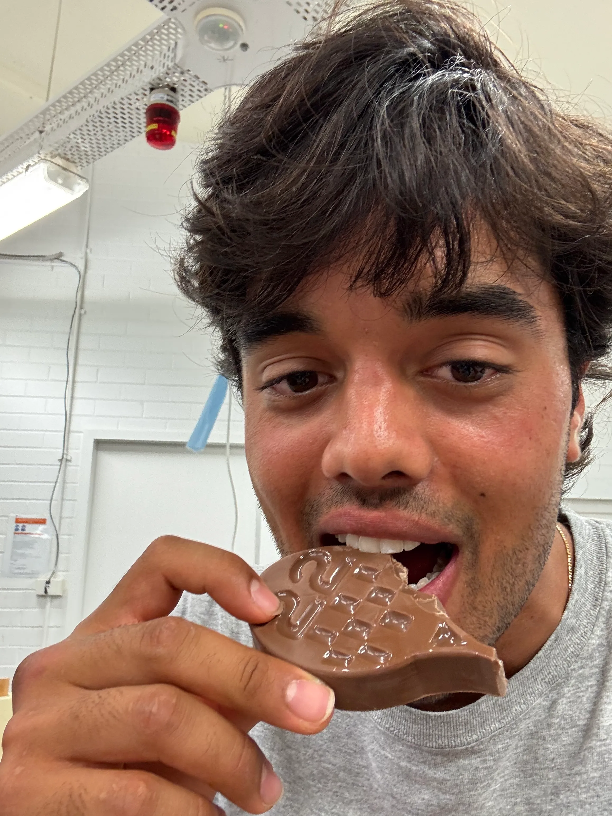
After three modules — print, cut, render — the project ended the way it should have. Someone bit it. The racquet held its shape. The chocolate did what chocolate does.
2025DECO2018University of Sydney