Design an interactive experience around care.
- Prompt
- Care — emotional, physical, social — mediated by digital technology.
- Medium
- Digital + physical + spatial, integrated. Not one-way; actually interactive.
- Frame
- 13 weeks · USYD Design Computing · A team of three took the project to mid-fidelity; high-fidelity was completed solo.
We narrowed early. Of all the forms care can take, we kept circling the one closest to us — students who had moved cities or countries for university, and the parents they had left behind. Loving, intact, quietly under strain — not from neglect, but from the friction of staying close at a distance.
”Mira had to be an emotional mirror, not a messaging app.” — Self-imposed constraint
Three forces working against care across distance.
Calls and texts demand performance.
When every check-in has to be a story, the contact thins — not because the relationship weakened, but because the format keeps raising its own bar.
Parents want updates. Students want space.
Parents reach for the details the student didn’t think to share. The student wants room the parent didn’t think to grant. Each reads the other slightly wrong.
Distance reads quiet as something bigger.
Once a gap opens, both sides hesitate to break it. The longer the pause, the heavier it feels — and the harder it becomes to close.
Four methods. Two sides of the same need.
We triangulated to keep one stream from biasing the rest. Each method earned a place because it told us something the others couldn’t.
Surveys
ScaleInterviews
TextureOnline ethnography
Unmoderated voiceMarket analysis
Honest baselineFrom four streamsFive insights surfaced. They didn’t sit on a single spectrum — they belonged to two distinct sides of the same relationship.
Need room — but not absence.
Independence from parental expectation without losing the relationship. Space to express a truer self, away from the fear of judgement. A positive family channel that doesn’t ask them to perform to use it.
Want to guide — and have to let go.
To keep guiding so their child doesn’t repeat the same mistakes. To hold open communication while quietly stepping back, and to hold the worry that comes with stepping back.
The young adult needs less contact, more trust. The parent needs more contact, less control.
Any product sitting between them had to make room for both — without becoming another thing to maintain.
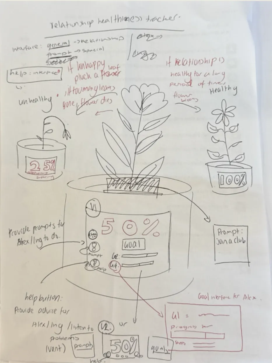
Nine storyboards. Three finalists. One survived feedback.
Each of us storyboarded three concepts — nine in total. We picked our most exciting on interest and creative potential, leaving three finalists to score against research insights, personas, the journey map, and the brief’s digital · physical · processual requirement.
After reviewFamily Plant won the matrix — but tutor feedback identified five specific concerns. Rather than start over, we held the concept and answered each.
Lacks lifestyle integration.
Reflections became quick, light, and optional — built to fit busy schedules.
Lacks spatial and procedural presence.
The app was replaced by a home-based physical plant — a presence in the room, not in a pocket.
Too app-dependent.
Content shifted onto the plant’s ambient display. No phone needed.
Doesn’t suit the parent’s lifestyle.
Simpler user flow built for the parent role.
Risks over-control.
Two-way communication removed. The plant gives passive, weekly updates — not constant access.
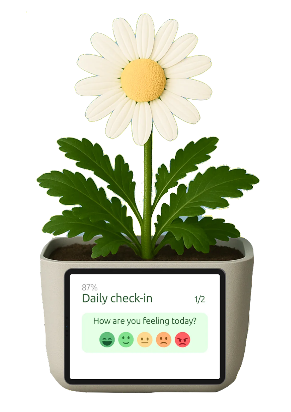
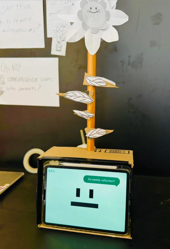
Meet Mira.
The chosen concept now had a name and a shape. Mira holds the three components of the brief in one object — a flower for the relationship’s mood, a screen for the conversation, a routine to hold them together.
- iPhysical
A flower that reflects the relationship.
The plant is the emotional anchor. Its bloom visibly shifts with the health of the relationship — bright and open when the channel is alive, drawn and pale when it isn’t.
- iiDigital
A small screen at the base.
A tablet hosts daily check-ins, weekly reflections, and gentle summary updates. Guided enough to be easy, soft enough not to feel like another inbox.
- iiiProcessual
A routine that does the work over time.
Quiet, recurring rituals — not bursts of contact. Check-ins and reflections turn the object into a steady, ongoing channel rather than another thing to maintain.
Becoming an objectFrom paper to colour to a thing on a desk, the screen and the object grew together.
Meet Alex.
Affinity diagramming pointed us at one user we kept returning to. Every Mira decision after this was tested against him.
”I want to meet new people, but I’m not sure where to start.”
- About
- Just left home to study abroad. Looking forward to independence, but every social decision is suddenly his alone. Signed up for a first-year networking event hoping it would do the work for him.
- Frustrations
- Uncertain approaching new people. Feels like everyone else has it figured out — and worries that admitting otherwise would make his parents call more, not less.
Alex’s year, traced along a single stem.
Starting university
Alex leaves controlling parents behind to start his university life — new place, new degree, a first-year networking event on the calendar.
Relief · uncertainAttending the event
Struggles to start conversations. Sits alone for the entire event. Wants to ask his parents for help but doesn’t know what to say — leaves feeling defeated.
Anxious · stressedQuiet retreat
Spends the year feeling sad and lonely. Still struggles to find his place and withdraws into his studies and personal space.
Fearful · self-doubtFifteen people. Twelve changes. One warmer Mira.
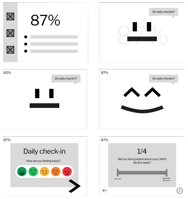
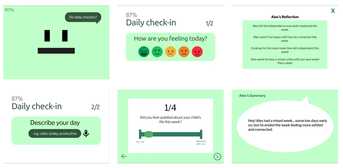
Part 1 ended with a working mid-fi. Part 2 was mine to push the rest of the way. I ran moderated tests with fifteen users — first-year students, parents, and a few fence-sitters — and grouped what they said into three patterns the concept hadn’t accounted for.
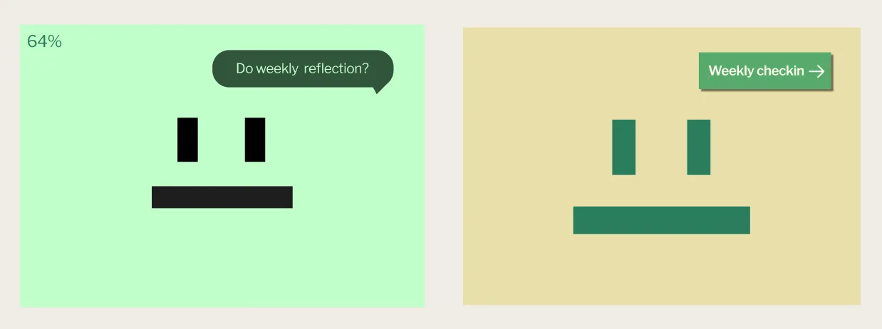
”I didn’t realise certain elements were interactive.”
Soft speech bubbles and the 64% relationship-health number read as decoration. The screen looked finished — but it wasn’t asking to be touched.
What changedSpeech bubble → labelled “Weekly check-in” button. Percentage removed entirely so attention falls on the one thing to tap.
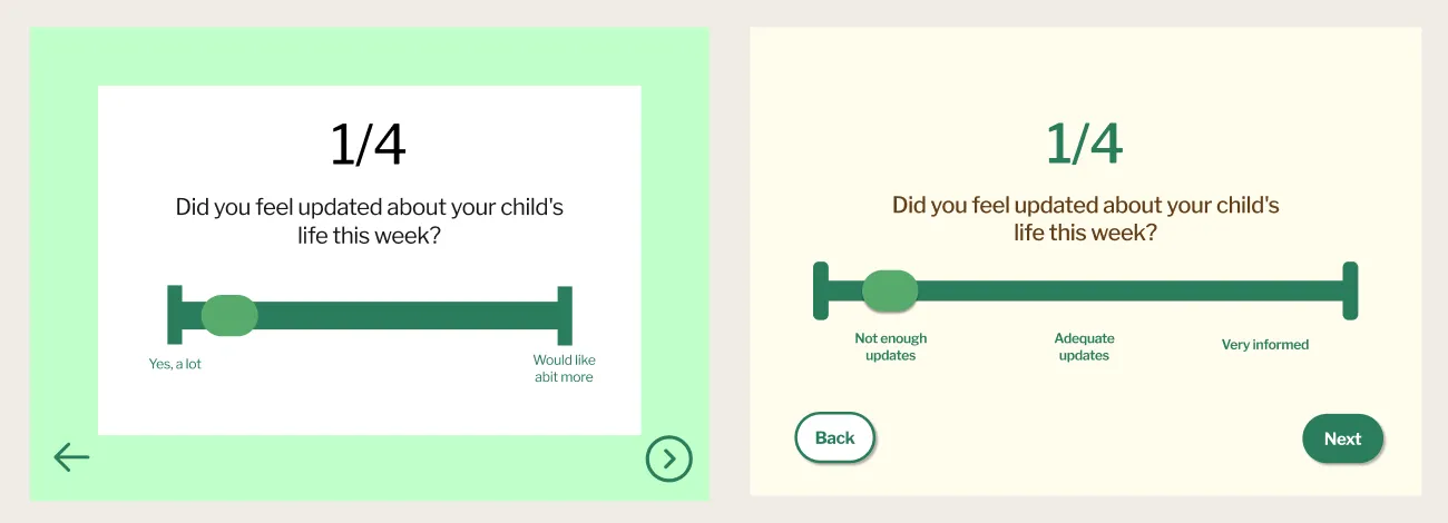
”I struggle when navigating the interface and want more control.”
Arrow-only navigation made every screen feel like guesswork. Users wanted to know they could go back, redo, or finish — and the sliders didn’t tell them where the ends meant.
What changedEvery screen earned labelled Back / Next / Done buttons. Sliders gained anchor labels at each interval. A redo button arrived on every voice prompt.
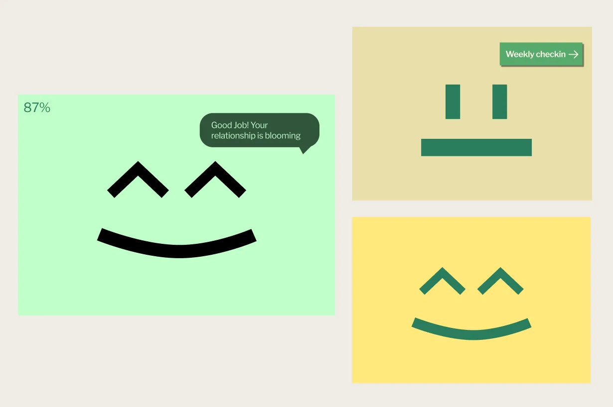
”I want it to feel warmer — not generic and flat.”
The mint palette was the loudest thing in the mid-fi, and users read it as clinical. Mira is meant to feel like a houseplant on a windowsill, not a hospital pamphlet — and the static 87% wasn’t carrying the emotional weight the concept asked it to.
What changedMint became cream, deep green, and warm clay. The percentage retired — the whole screen now takes a colour that maps to the plant’s health, so the relationship’s mood is felt before it’s read.
And the object itselfThe plant on the desk needed the same honesty. The paper flower had done its job in the mid-fi — but the hi-fi asked Mira to be believable as a houseplant.
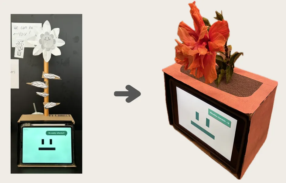
Mira, finished.
A warmer palette. A clearer flow. A real flower. The pieces that started as a team-of-three concept now hold together as one object — quiet enough to live on a desk, honest enough to be noticed.
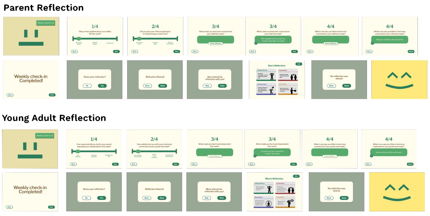
Try Mira yourself.
Tap through the weekly check-in — the same flow fifteen users ran in testing. Best viewed full-screen.
Mira, in action.
The Part 2 brief asked for a short showcase video — the prototype in motion, the object on a desk, and the routine that holds them together.
What Part 2 taught me.
The concept was right; the expression wasn’t. What read as restraint to the team that built it read as ambiguity to everyone else — a speech bubble that wasn’t a button, a percentage that didn’t ask to be touched, a palette that meant clinical to the only people who hadn’t lived inside the brief. Fifteen sessions made that gap impossible to ignore. Recognition, control, and warmth are easy to talk about and harder to make true.
The other thing I’ll carry forward sits on the desk. A paper flower works in mid-fi because everything else is still draft. The moment the screen earns its colour, the object has to earn its life too — or the whole thing slips back into prop. Hi-fi isn’t a polish pass. It’s the round where the design either commits to being the thing it claims to be, or quietly admits it isn’t.